Traditional Colors of Ukiyo-e: The Story of “Japan Blue” and Historical Color Palettes
When we look at ukiyo-e prints, one of the first things we notice is their unique and memorable use of color. The blues feel deep and calm, the reds are striking yet refined, and even the limited palettes seem to create a sense of balance.
These colors are not random. They are rooted in history, culture, and a refined sense of aesthetics developed over centuries in Japan. Understanding these traditional colors can transform the way you approach coloring—not just as a technical task, but as a cultural experience.
Why Ukiyo-e Colors Feel Special
The beauty of ukiyo-e lies not only in its composition, but also in its restrained and intentional use of color. Unlike modern designs that often rely on a wide range of hues, traditional Japanese art tends to work within a limited palette.
This limitation is not a restriction—it is a choice. By reducing the number of colors, artists created harmony and clarity. Each color has a role, and nothing feels excessive.
When coloring in this style, you are not simply choosing colors. You are choosing a mood, a historical reference, and a way of seeing beauty through simplicity.
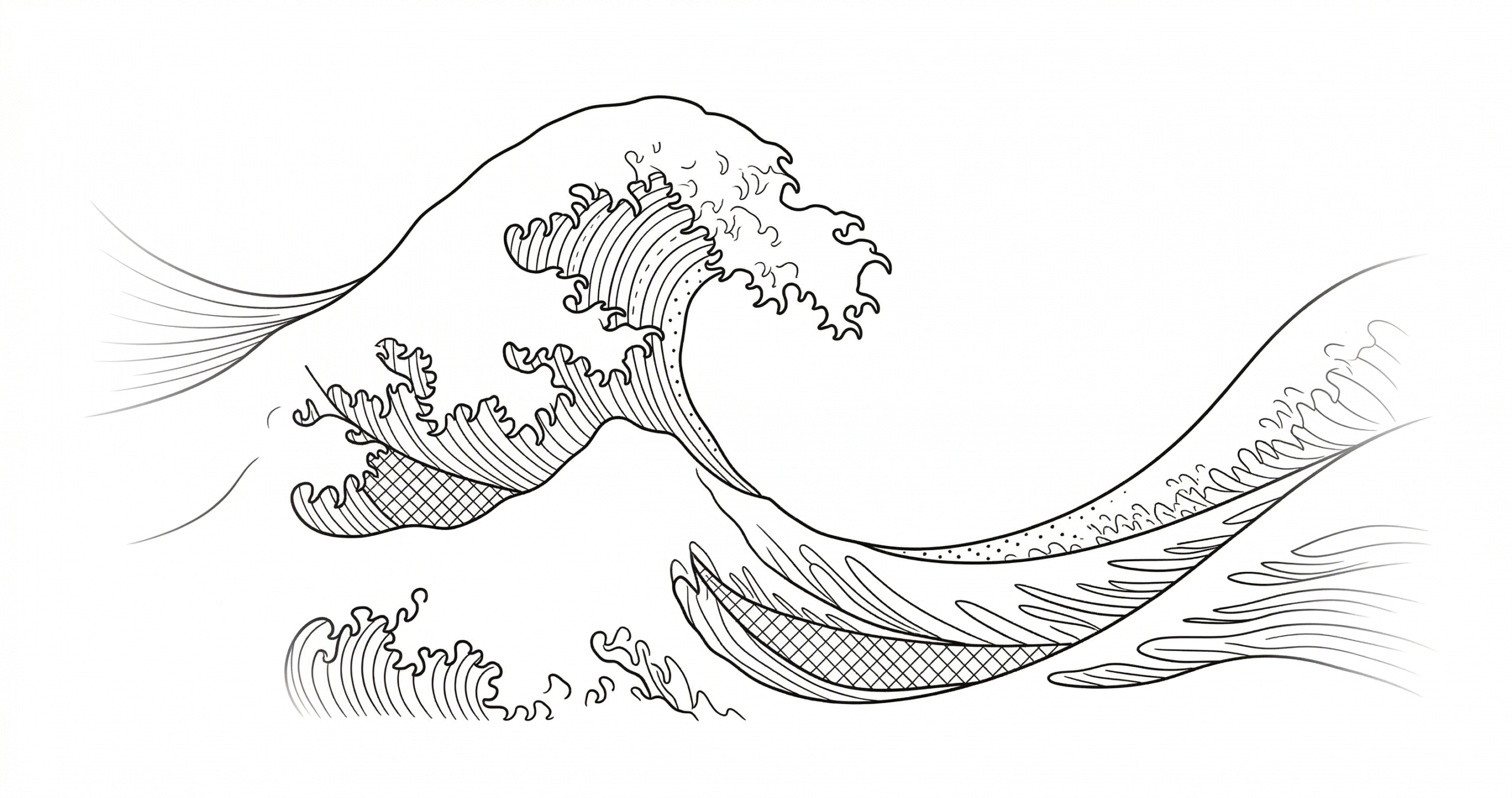
The Calm Depth of Tade Indigo: “Japan Blue”
One of the most iconic colors in Japanese art is indigo, traditionally made from tade-ai (Japanese indigo plants). During the Edo period, indigo dye became widely used in clothing and daily life.
Foreign visitors to Japan were so impressed by the prevalence and beauty of this color that they began calling it “Japan Blue.”
Unlike bright or artificial blues, traditional indigo has a quiet depth. It feels natural, slightly muted, and deeply calming. When used in coloring, it creates a sense of stability and timelessness.
If you want your work to feel classical and grounded, indigo is an excellent choice.
Prussian Blue: A Dramatic Shift in Color
In contrast to traditional indigo, Prussian blue (known in Japan as bero-ai) brought a dramatic change to Japanese art.
This pigment was imported from Europe in the late Edo period and quickly gained popularity among artists. Katsushika Hokusai famously used it in works such as “Thirty-Six Views of Mount Fuji.”
Prussian blue is brighter, more vivid, and more striking than traditional indigo. It creates contrast and draws attention.
Choosing between indigo and Prussian blue is more than a technical decision. It reflects the atmosphere you want to create—calm and traditional, or bold and dynamic.
The Meaning of Purple, Red, White, and Gold
In Japanese culture, colors often carry symbolic meaning.
Purple has long been associated with nobility and high status. Historically, it was reserved for the imperial court and aristocracy. Using purple in your coloring can add a sense of elegance and refinement.
Red and white together are considered celebratory colors, often used in festivals and special occasions. They symbolize joy, purity, and good fortune.
Gold, especially when slightly muted or mixed with green tones, adds a quiet sense of richness. It enhances the composition without overwhelming it.
By combining these colors thoughtfully, you can create a composition that feels both meaningful and visually balanced.
The Beauty of Limiting Your Palette
One of the most effective ways to improve your coloring is to limit the number of colors you use.
Instead of choosing from an endless spectrum, try working with a small palette inspired by traditional Japanese colors. This approach naturally creates harmony and prevents the composition from becoming chaotic.
Artists from the Nara to Edo periods often worked within such constraints, and their works continue to feel refined and timeless.
By reducing your choices, you make each decision more intentional. The result is a cleaner, more elegant image.
Final Thoughts
Coloring inspired by ukiyo-e is not just about filling shapes—it is about connecting with a long tradition of visual culture.
By understanding the meaning and history behind colors like indigo, Prussian blue, and traditional ceremonial palettes, you can bring depth and intention to your work.
In the end, the goal is not to replicate history perfectly, but to experience it in your own way. Through color, you can step into the aesthetic world of Edo Japan and create something both personal and timeless.