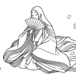
A Practical Guide to Seasonal Color Palettes: Recreating “Kasane no Irome” with Colored Pencils
Traditional Japanese color harmony can feel beautiful in theory, but its real power appears when you begin to use it in practice. Once you understand kasane no irome as more than a historical curiosity, it becomes a practical and surprisingly modern tool for coloring.
Instead of facing an endless number of color choices, you can treat these historical combinations as ready-made palette guides. They help you build harmony, contrast, and seasonal atmosphere with confidence.
- From Theory to Practice: Using Historical Color Codes as a Coloring Cheat Sheet
- A Spring Recipe: “Kōbai no Nioi” and Young Green
- A Summer Recipe: The Cool Contrast of “Kakitsubata”
- An Autumn Recipe: “Hajimomiji” and the Depth of Warm Reds
- Recreating the “Translucent” Effect of Layered Color
- Putting It into Practice in Your Coloring
- Final Thoughts
From Theory to Practice: Using Historical Color Codes as a Coloring Cheat Sheet
One of the most difficult parts of coloring is simply deciding which colors belong together. Too many choices can create hesitation, and hesitation often leads to muddy or inconsistent results.
This is where kasane no irome becomes especially useful. The Heian court did not treat color as random decoration. Color combinations were carefully refined to express season, rank, mood, and poetic sensitivity.
For modern coloring, this means you do not have to invent harmony from scratch. You can begin with combinations that have already been tested by history. In that sense, these palettes work almost like a cheat sheet—not in a lazy way, but in a refined and intelligent one.
A Spring Recipe: “Kōbai no Nioi” and Young Green
One of the most elegant spring-inspired combinations is kōbai no nioi, often associated with the image of plum blossoms opening from deep bud-red into soft pink. It captures the quiet energy of early spring: the moment when color begins to awaken after winter.
In practical coloring terms, this palette works beautifully as a gradient. Start with a deeper crimson or rose tone in the strongest areas, then gradually move into pale pink. A touch of young green can be added in surrounding details to suggest new growth and freshness.
This combination feels celebratory without being loud. It is ideal for floral motifs, patterned garments, or any area where you want a youthful and graceful mood.
A Summer Recipe: The Cool Contrast of “Kakitsubata”
Kakitsubata, inspired by the iris, offers a more dramatic but still elegant summer palette. Traditionally, it combines a reddish violet on the surface with blue or fresh green beneath, creating a cool and layered effect.
This makes it especially suitable for scenes that suggest water, shade, and midsummer clarity. In coloring, you can translate this into a main layer of soft violet with accents of blue-green or fresh leaf tones nearby.
The beauty of this combination lies in its contrast. Purple and green can easily become too strong if handled carelessly, but within the logic of kasane no irome, their balance feels intentional and refreshing rather than harsh.
An Autumn Recipe: “Hajimomiji” and the Depth of Warm Reds
Autumn calls for deeper, quieter colors, and hajimomiji offers exactly that. This palette is rooted in the image of leaves deepening in color and the atmosphere becoming richer as the season moves forward.
Traditionally, combinations such as dark crimson, muted red, and suō-like tones create a sense of maturity and warmth. These are not bright festive reds; they are reds softened by depth, age, and shadow.
For coloring, this palette is excellent for kimono fabrics, autumn leaves, rich borders, or warm textile patterns. It gives an illustration a sense of depth and emotional weight.
Recreating the “Translucent” Effect of Layered Color
One of the most fascinating aspects of kasane no irome is that it was not only about flat color placement. In layered court clothing, a pale outer fabric could reveal the tone of a stronger inner layer beneath it. This created a soft, almost translucent impression.
You can imitate this effect with colored pencils through light layering. Instead of pressing hard with a single color, apply one pale tone first and then add a second tone gently over or beneath it, allowing the paper and previous layer to remain visible.
This method is particularly effective when trying to create the feeling of flower petals, lined kimono fabric, or subtle changes in seasonal light. It brings softness and sophistication to the page.
Putting It into Practice in Your Coloring
These palettes are especially useful in designs that include garments, accessories, or patterned decorative areas. If you are coloring a kimono-inspired illustration, for example, you can use one tone as the main robe color and another as the obi, collar, lining, or small accessory accent.
This immediately gives your image more structure. Instead of choosing every color independently, you allow one relationship to guide the rest. The result feels more intentional and coherent.
In this way, kasane no irome becomes not just a historical idea, but a practical creative tool—one that helps you color with less stress and greater elegance.
Final Thoughts
The beauty of kasane no irome lies in its ability to give order to color without removing creativity. It does not force a single answer. Instead, it offers a beautifully tested starting point.
By borrowing these seasonal palettes, you can bring the spirit of Heian color harmony into modern coloring practice. More importantly, you can free yourself from the fear of choosing “wrong” colors and begin working with confidence.
Sometimes the most elegant creativity begins not with unlimited freedom, but with a beautiful pattern to follow.